
Contrast is what makes a room feel finished rather than flat. It’s the deliberate pairing of opposing elements, dark against light, rough against smooth, matte against gloss, that gives a space depth and visual interest. Without it, even well-furnished rooms can feel like they’re missing something. The good news? Creating effective contrast doesn’t require a design degree or a gut renovation. It’s about understanding a few core principles and applying them strategically to walls, floors, furnishings, and finishes. This guide walks through the essential types of contrast, how to use them without creating visual chaos, and the common pitfalls that trip up even experienced DIYers.
Key Takeaways
- Contrast in interior design—created through opposing colors, textures, materials, and scales—prevents monotony and gives spaces visual depth and structure without requiring expensive renovations.
- The most effective contrast-based rooms use the 60-30-10 rule: 60% dominant neutral, 30% secondary element, and 10% bold accent to create balance rather than visual chaos.
- Color contrast is the most accessible DIY tool; a single gallon of contrasting trim paint can redefine a room for under $40 and should be tested in actual lighting before application.
- Texture and material contrast (matte vs. glossy, smooth vs. rough) add depth to neutral schemes and work especially well in kitchens and bathrooms for both style and functionality.
- Contrast improves room readability by establishing clear visual boundaries between surfaces, making spaces easier to navigate and maintain while also influencing perceived room size and proportion.
- Common contrast mistakes include over-contrasting every element, ignoring undertones, choosing aesthetics over function, and applying bold contrast to spaces meant for rest rather than active use.
What Is Contrast in Interior Design?
Contrast in interior design refers to the intentional use of opposing or markedly different elements within a space to create visual distinction. It’s not just about color, though that’s often the most obvious application. Contrast encompasses differences in tone (light vs. dark), texture (smooth vs. rough), scale (large vs. small), shape (angular vs. curved), and material (natural vs. industrial).
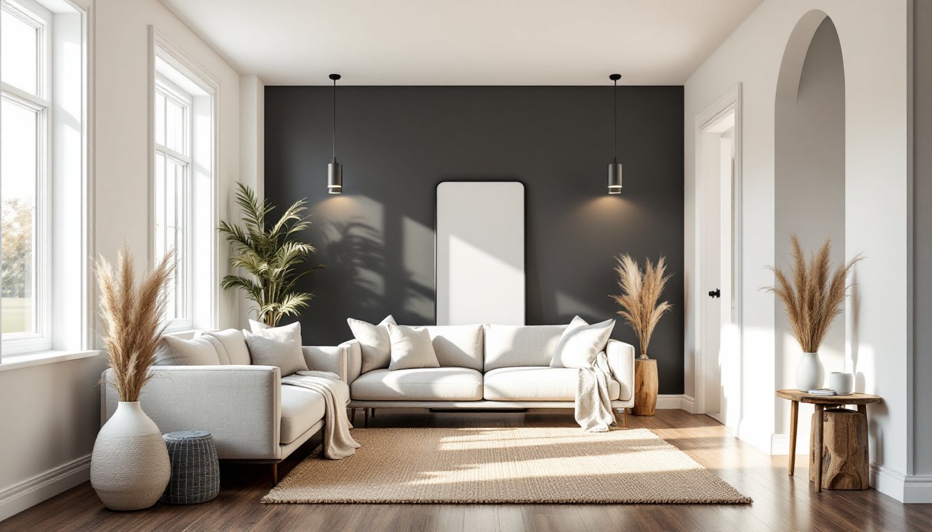
In practical terms, contrast is what stops the eye and gives it somewhere to land. A white room with white furniture, white trim, and pale floors might be calming, but it lacks definition. Add black window frames, a charcoal area rug, or even dark-stained ceiling beams, and suddenly the architecture reads clearly. The room gains structure.
Designers rely on contrast to establish focal points, define zones in open-plan layouts, and highlight architectural features. For DIYers, it’s a tool that works at every budget level, from paint and hardware swaps to material choices in a larger remodel. The key is deliberate choice, not accident.
Why Contrast Matters in Your Home
Contrast serves both functional and aesthetic purposes. Visually, it prevents monotony. Rooms that rely on a single color family or finish can feel washed out or lifeless, especially under varying lighting conditions. Contrast adds dimension and makes spaces feel more dynamic without requiring additional square footage or expensive furnishings.
From a practical standpoint, contrast improves readability of a space. It helps the eye distinguish between walls and trim, floor and baseboard, cabinetry and countertop. This is especially important in kitchens and bathrooms, where clear visual boundaries make the space easier to navigate and maintain. High-contrast edges also make cleaning and touch-ups simpler, you’re not guessing where one surface ends and another begins.
Contrast also influences perceived room size and proportion. Dark floors paired with light walls can make ceilings feel taller. A dark accent wall can pull focus and make a long, narrow room feel more balanced. Conversely, low-contrast schemes tend to blur boundaries, which can make small spaces feel more open but may sacrifice definition.
Finally, contrast allows homeowners to express style without committing to a single aesthetic. A modern space can incorporate rustic wood through textural contrast. A minimalist room can handle bold color if it’s used sparingly against neutral surroundings. It’s the bridge that makes eclectic or transitional design work.
Types of Contrast You Can Use
Color Contrast
Color contrast is the most direct and accessible form. It can be as bold as black and white or as subtle as navy and charcoal. The key is value difference, how light or dark a color appears relative to its surroundings.
High-contrast color schemes (think crisp white subway tile with black grout, or a charcoal gray accent wall in an otherwise neutral room) create drama and clarity. They’re particularly effective in modern, industrial, or Scandinavian-inspired interiors. On the DIY front, paint is the easiest lever to pull. A single gallon of trim paint in a contrasting shade, such as SW Pure White against SW Repose Gray walls, can redefine a room for under $40.
Low-contrast color pairings (beige and cream, soft gray and white) offer subtlety and sophistication but require careful attention to undertones. Without enough differentiation, the effect can read as unintentional or poorly matched rather than cohesive.
For DIYers working with existing finishes, color contrast often shows up in:
- Cabinet and wall color (white uppers, dark lowers, or vice versa)
- Trim and door color against wall paint
- Accent walls in a single bold or deep tone
- Tile patterns, such as checkerboard floors or contrasting grout
One practical note: when choosing contrasting paint colors, test samples on multiple walls and observe them at different times of day. Natural and artificial lighting can shift undertones and reduce perceived contrast.
Texture and Material Contrast
Texture and material contrast add tactile and visual interest without relying on color. This is especially useful in neutral or monochromatic schemes where color variation is minimal. Pairing smooth and rough, matte and glossy, or natural and industrial materials gives a space depth that color alone can’t achieve.
Common applications include:
- Matte wall paint paired with semi-gloss or satin trim (a standard residential finish combo that enhances molding profiles)
- Rough-sawn or reclaimed wood against smooth drywall or plaster
- Polished concrete or tile floors with textured area rugs (jute, wool, sisal)
- Brushed or matte black hardware on glossy cabinetry
- Metal accents (steel, brass, iron) mixed with natural wood or stone
In kitchens and bathrooms, material contrast is both functional and stylish. A honed marble countertop (matte finish) paired with glossy ceramic backsplash tile offers easy-clean surfaces with visual variation. Similarly, mixing stainless steel appliances with wood-tone cabinetry and stone counters creates a layered, professional look.
For DIYers tackling trim or millwork, even the profile and finish matter. Flat-profile baseboards in a satin finish read differently than traditional Colonial-style trim in semi-gloss. The play of light across different surfaces creates shadow lines and highlights that enhance contrast without additional color.
One caution: too many competing textures can feel busy. Limit high-texture materials to one or two key areas, an accent wall, a statement floor, or a feature countertop, and let smoother surfaces balance them out.
How to Apply Contrast Without Overwhelming Your Space
Effective contrast is about balance, not shock value. The goal is to guide the eye, not exhaust it. Here’s how to layer contrast without tipping into chaos.
Start with a dominant neutral. Most successful high-contrast interiors begin with a base of white, gray, beige, or another neutral that covers 60–70% of the visual field (walls, ceiling, large furniture). This gives the eye a place to rest and makes bolder contrasting elements feel intentional rather than random.
Choose one or two focal points. Contrast works best when it’s concentrated. A single dark accent wall, a bold backsplash, or a statement light fixture will have more impact than scattering contrast across every surface. In a living room, that might be a deep-toned media wall or a pair of dark window frames. In a kitchen, it could be lower cabinets in a contrasting finish or a patterned tile floor.
Use the 60-30-10 rule as a guide. This classic design formula allocates 60% of a room to a dominant color or tone, 30% to a secondary element, and 10% to an accent. For contrast, the 10% is where you go bold, black hardware, a dark wood island, a pop of saturated color. It keeps the room cohesive while allowing contrast to shine.
Pay attention to scale. Large-scale contrast (an entire wall, a floor) makes a strong statement and works well in spacious rooms. Small-scale contrast (grout lines, cabinet pulls, trim) is subtler and suits tighter spaces or those with less natural light. Mixing scales, say, a bold floor pattern with understated walls and trim, adds complexity without clutter.
Test before committing. Paint samples, fabric swatches, and tile samples should be viewed in the actual space under both natural and artificial light. What reads as crisp contrast in the store can fall flat, or feel too harsh, once installed. For larger projects (flooring, cabinetry), request samples and live with them for a few days.
Don’t forget lighting. Contrast is heavily influenced by light. A dark wall in a north-facing room with limited windows can feel oppressive, while the same color in a bright, south-facing space feels anchoring. Add task and accent lighting to ensure contrasting elements remain visible and don’t disappear into shadow.
Common Mistakes to Avoid When Using Contrast
Over-contrasting. More isn’t always better. A room with black walls, white furniture, dark floors, and high-contrast art can feel jarring rather than cohesive. If every element screams for attention, none of them land. Limit high-contrast moves to one or two key areas and let the rest support rather than compete.
Ignoring undertones. Not all whites or grays are created equal. A cool gray wall paired with warm beige trim can look unintentional, even if the value contrast is strong. Always compare undertones, cool vs. warm, and ensure they complement rather than clash.
Skipping the transition. Abrupt contrast without a visual bridge can feel disjointed. If pairing a dark island with light perimeter cabinets, consider a countertop material or hardware finish that ties the two together. Small linking elements (a rug, a piece of art, a shared accent color) help unify contrasting zones.
Choosing contrast over function. High-contrast grout in a shower looks striking until it’s time to clean it. Dark matte paint on trim shows every fingerprint. Before committing, consider maintenance. If a surface sees heavy use, a more forgiving finish or color may serve better in the long run.
Forgetting about lighting conditions. A color or finish that works beautifully in a showroom may read completely differently in a dim hallway or a room with afternoon sun. Always test materials in the actual space and at different times of day.
Contrast without context. Not every room needs bold contrast. In bedrooms or spaces meant for rest, subtler tonal variation may be more appropriate. Reserve high-contrast treatments for active spaces, kitchens, entryways, living areas, where energy and definition support the room’s function.
Contrast is a tool, not a rule. Used thoughtfully, it transforms flat, forgettable spaces into rooms with personality and presence. The trick is knowing when to push and when to pull back.