
Choosing paint colors that actually work together can feel like guesswork, until someone learns the color wheel. This tool, borrowed from fine art and design theory, takes the mystery out of matching hues, creating contrast, and building cohesive palettes that elevate every room. Whether tackling a single accent wall or planning a whole-house refresh, understanding how colors relate on the wheel prevents costly do-overs and buyer’s remorse at the paint counter. The color wheel isn’t about rigid rules: it’s a practical framework that helps DIYers and designers alike make confident, intentional choices that transform spaces from bland to balanced.
Key Takeaways
- The color wheel organizes primary, secondary, and tertiary colors to reveal which hues harmonize, clash, or create intentional contrast in interior design.
- Complementary colors (opposite on the wheel) create bold drama best used as 10-20% accents, while analogous colors (neighboring hues) deliver calm harmony ideal for bedrooms and relaxation spaces.
- Triadic color schemes use three evenly-spaced hues and require a 60-30-10 dominant-secondary-accent ratio to avoid visual chaos while maintaining vibrant balance throughout your space.
- Always test paint samples on actual walls for 48 hours, checking different times of day and lighting types, since undertones and light direction dramatically affect how colors read in a room.
- Layering variation in saturation and value—pairing bold and muted tones together—prevents flat or overwhelming results, while neutral trim in white or off-white provides visual breathing room between bolder color zones.
- Matching wall color to existing flooring, cabinetry, and fixed finishes using the color wheel framework prevents costly repaints and ensures a cohesive, intentional design that transforms spaces from bland to balanced.
What Is the Color Wheel and Why Does It Matter in Interior Design?
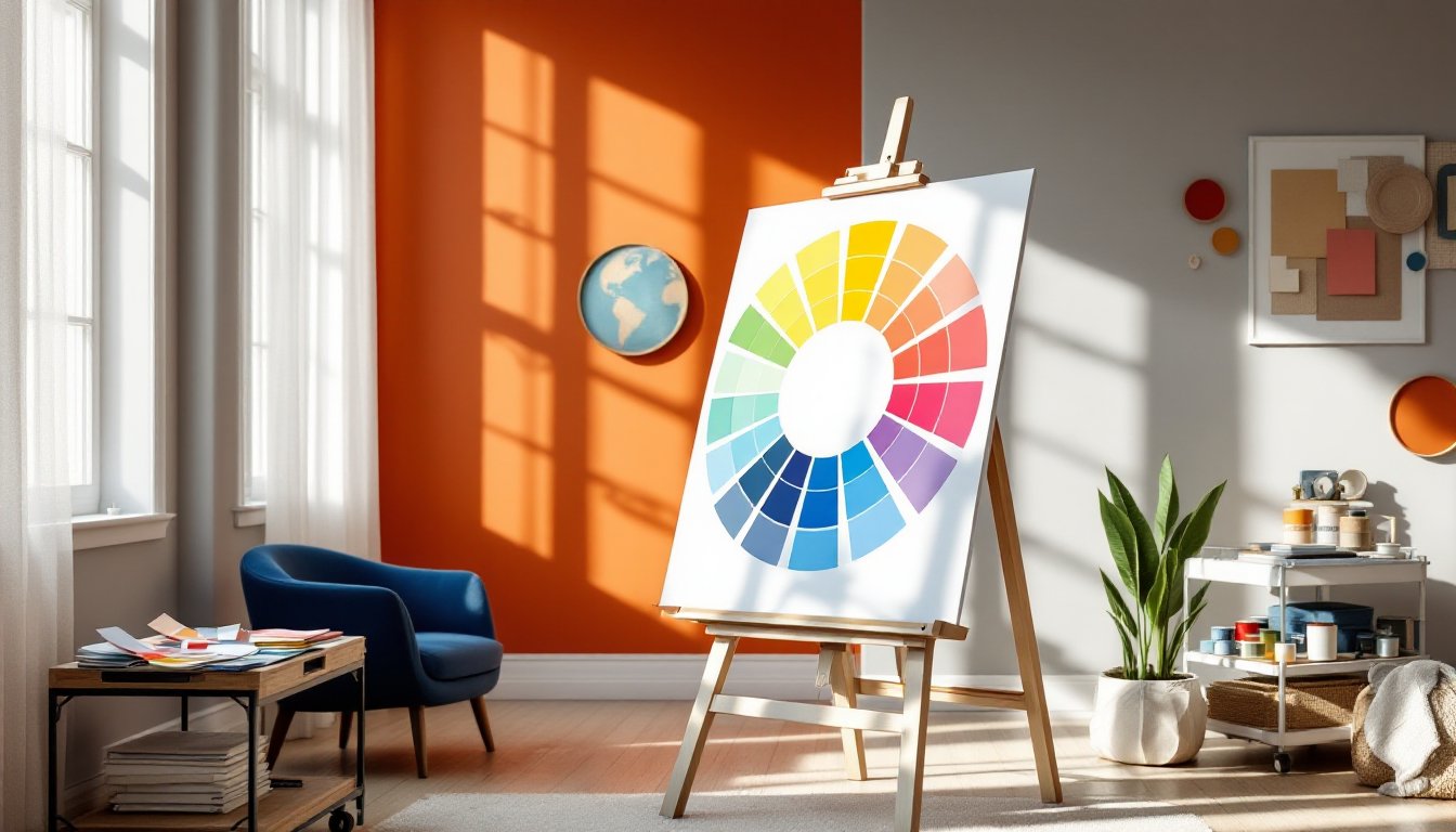
The color wheel is a circular diagram that organizes colors by their relationships: primary colors (red, blue, yellow), secondary colors (green, orange, purple, mixed from primaries), and tertiary colors (combinations like red-orange or blue-green). It’s been around since the 1600s, but interior designers still rely on it daily because it maps out which colors harmonize, which clash intentionally, and which create visual tension.
In practical terms, the wheel helps homeowners avoid the “everything matches but nothing goes together” trap. It reveals why a navy sofa and burnt orange pillows feel right, or why certain greiges turn sickly under north-facing light. By learning just a few core schemes, complementary, analogous, and triadic, anyone can walk into a paint store or fabric shop with a plan instead of a Pinterest screenshot and crossed fingers.
The wheel also accounts for saturation (how pure or muted a color is) and value (how light or dark). A soft sage and deep forest green sit near each other on the wheel but deliver entirely different moods. Understanding these variables keeps palettes from feeling flat or chaotic, especially when layering wall color, trim, furnishings, and accessories across a room.
Understanding the Three Color Wheel Schemes Every Designer Uses
Complementary Colors: Creating Bold, Dynamic Contrast
Complementary colors sit directly opposite each other on the wheel: red and green, blue and orange, yellow and purple. These pairings create maximum contrast and visual energy, making them ideal for spaces that need a focal point or a jolt of personality.
In practice, using complements at full saturation can feel overwhelming, think Christmas or a kid’s playroom. The trick is adjusting value and saturation. A muted terracotta (low-saturation orange) paired with soft teal (low-saturation blue) delivers contrast without the visual noise. Use the bolder hue as an accent, 10-20% of the room, and the softer complement as the dominant color. This ratio keeps the scheme lively but livable.
Complementary schemes work well in dining rooms, home offices, or entryways where a bit of drama supports the room’s function. Skip them in bedrooms unless the goal is energizing a workout space or creative studio.
Analogous Colors: Achieving Calm, Cohesive Harmony
Analogous colors are neighbors on the wheel, any three to five hues sitting side by side, like blue, blue-green, and green, or yellow, yellow-orange, and orange. These schemes feel naturally harmonious because they share a common base color, creating smooth transitions and a restful visual flow.
Analogous palettes excel in bedrooms, living rooms, and bathrooms where relaxation is the priority. They’re forgiving for DIYers because even slightly mismatched shades still read as intentional. A soft sky blue on the walls, seafoam green bedding, and pale aqua curtains blend seamlessly without requiring a designer’s eye.
The risk with analogous schemes is monotony. Without variation in value or texture, the room can feel flat. Mix in one darker anchor shade (deep navy in a blue-green scheme) and vary finishes, matte walls, satin trim, linen upholstery, glazed ceramic. This layering adds depth without breaking the color harmony.
Triadic Colors: Balancing Vibrant Energy Throughout Your Space
Triadic schemes use three colors evenly spaced around the wheel, like red, yellow, and blue, or orange, green, and purple. These combinations are inherently vibrant and balanced, offering more variety than analogous schemes and more cohesion than complementary ones.
Triadic palettes require restraint. Equal amounts of all three hues can look chaotic, so designers typically choose one dominant color (60% of the room), one secondary (30%), and one accent (10%). For example, a living room might feature soft gray-blue walls (dominant), goldenrod throw pillows and a rug (secondary), and a few coral accessories (accent). The triad is present but controlled.
This scheme suits playrooms, creative studios, eclectic kitchens, or any space where personality takes precedence over serenity. It’s also flexible, shifting the saturation or value of all three colors can take a triadic palette from bold primary brights to sophisticated jewel tones or even subtle pastels.
How to Apply Color Wheel Principles to Different Rooms
Every room has a function, and the color wheel helps match palette to purpose. Kitchens benefit from energizing but appetite-friendly schemes, warm analogous palettes like cream, peach, and coral, or a complementary pairing of soft yellow and gray-violet. Avoid overly cool schemes (heavy blues or grays) in kitchens meant for gathering: they can feel clinical.
Bedrooms call for low-contrast analogous or monochromatic schemes. Blues, greens, and soft lavenders lower visual stimulation and support rest. If a homeowner craves a bolder look, use a complementary accent sparingly, a deep plum headboard wall in a soft sage room, and keep bedding neutral.
Living rooms are the most flexible. Analogous schemes create a cozy, pulled-together feel, while triadic palettes work if the room has good natural light and high ceilings to handle the energy. Complementary accents, teal pillows on a rust sofa, add visual interest without committing every surface.
Bathrooms can handle drama in small doses. A powder room is a great place to test a bold complementary scheme (charcoal walls, brass fixtures, and burnt orange towels). Full baths benefit from calming analogous schemes, especially in homes with one shared bathroom where multiple users need to feel comfortable.
Home offices and studios thrive on triadic or complementary schemes that stimulate focus without distraction. A navy desk wall (cool, grounding) with mustard shelving (warm, energizing) and white trim (neutral break) keeps the space lively but not chaotic.
Always test paint samples on multiple walls and observe them at different times of day. North-facing rooms skew cool and can make warm colors look muddy: south-facing spaces intensify warm tones and can wash out cool ones. Artificial lighting, LED daylight vs. warm incandescent, also shifts how colors read. Buy sample pots, paint 2′ x 2′ swatches, and live with them for at least 48 hours before committing to gallons.
Common Color Wheel Mistakes to Avoid in Your Home
The biggest mistake is ignoring undertones. A “neutral” beige can lean pink, yellow, or gray depending on its base, and those undertones clash with other colors in unexpected ways. Always compare paint chips to existing flooring, countertops, and fixed finishes in the same light the room receives. A cool-gray wall next to honey oak trim will emphasize the yellow in the wood, often unfavorably.
Using too many saturated colors is another pitfall. Even a well-planned triadic scheme falls apart if all three hues are at full intensity. Varying saturation and value, one bold, one medium, one soft, creates visual hierarchy and breathing room.
Forgetting about white and neutral trim is common among beginners. Trim, ceilings, and baseboards in crisp white or soft off-white act as visual rests, giving the eye a break between bolder wall colors and furnishings. This is especially important in open-concept layouts where multiple color zones meet.
Some DIYers choose colors in isolation without considering the whole room. Wall color is just one element: it must harmonize with flooring, cabinetry, upholstery, and fixed tile or stone. Bring fabric swatches, flooring samples, and cabinet door samples to the paint store. Most retailers have color-matching tools and knowledgeable staff who can flag potential clashes.
Finally, skipping primer or using the wrong sheen undermines even a perfect palette. Dark or bold colors need a tinted primer to achieve true color in fewer coats. High-traffic areas (hallways, kitchens) benefit from satin or eggshell sheens that wipe clean, while low-traffic spaces (dining rooms, bedrooms) can use matte for a softer look. Sheen affects how color reflects light, so factor that into the scheme.
The color wheel isn’t a cage, it’s a guide. Once someone understands complementary, analogous, and triadic relationships, they can bend or break the rules intentionally. But starting with these foundations prevents the kind of expensive, regrettable misfires that lead to repainting six months later.