
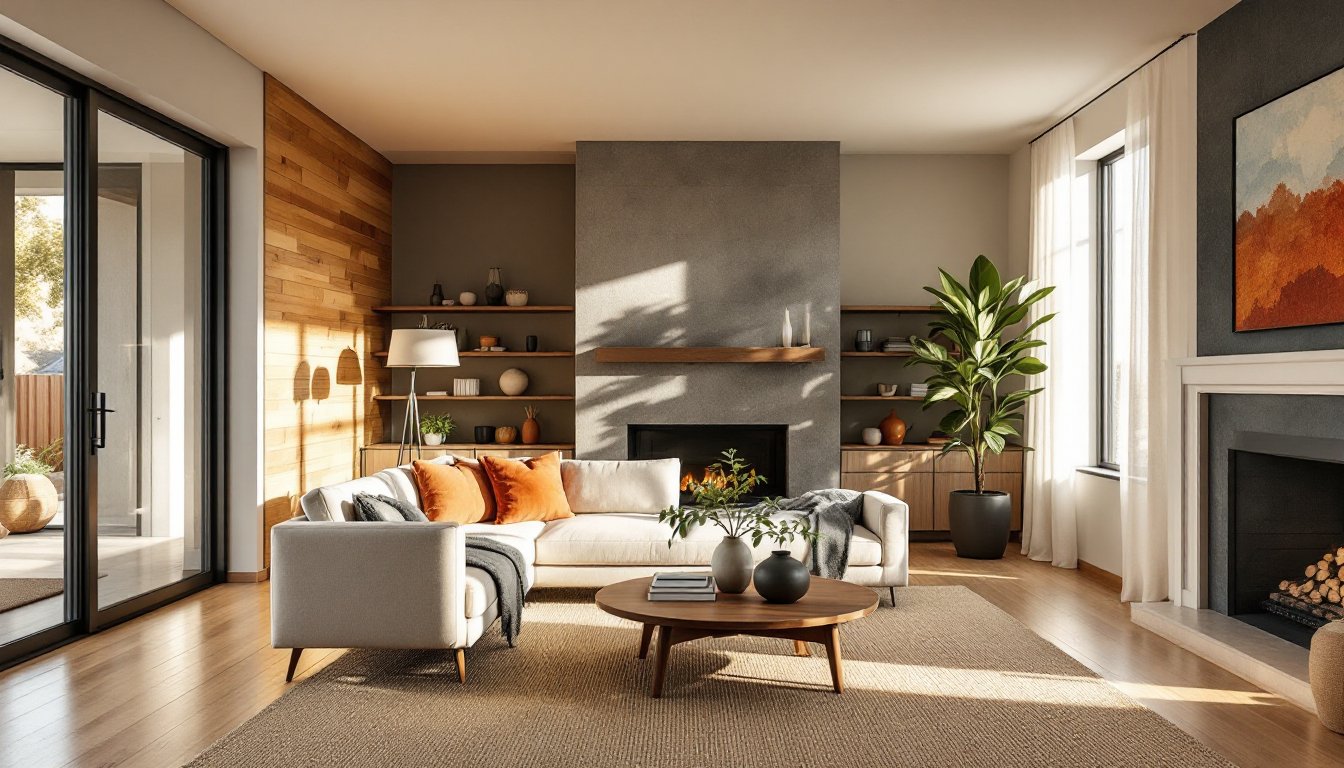
Earth tones have become the backbone of modern interior design, not because they’re trendy, but because they work. These colors anchor a room without overwhelming it, create visual warmth without the fuss of bold patterns, and pair well with nearly any architectural style from mid-century ranches to new construction. Unlike stark whites or high-contrast schemes that demand constant upkeep and careful styling, earth tone palettes offer flexibility and forgiveness. They hide minor wall imperfections, complement natural light throughout the day, and provide a neutral foundation that adapts as furnishings and needs change over time.
Key Takeaways
- Earth tones interior design creates visual warmth and flexibility without overwhelming spaces, making them forgiving of wall imperfections and varying lighting conditions throughout the day.
- Choose a dominant base color with an LRV between 40–60 for warmth without sacrificing brightness, then layer supporting earth tones and accents based on room orientation and natural light.
- Balance earth tone palettes by combining materials like wood, stone, textiles, and metal accents to add depth and texture, preventing the space from feeling flat or monotonous.
- Layer your lighting with ambient, task, and accent fixtures using warm 2700K–3000K bulbs, and incorporate reflective surfaces like mirrors to counteract the light-absorbing nature of earth tone walls.
- In kitchens and bathrooms, select one dominant earth tone element (cabinetry or tile) and keep remaining surfaces neutral to prevent visual clutter while maintaining the cohesive theme.
- Match grout color to be one or two shades darker than earth tone tile to hide staining and enhance the organic aesthetic, avoiding bright white grout that creates unwanted grid patterns.
What Are Earth Tones and Why They’re Perfect for Modern Homes
Earth tones pull directly from nature’s palette: warm browns, soft taupes, terracotta, sage greens, clay reds, slate grays, and sandy beiges. These aren’t decorator inventions, they’re the colors found in soil, stone, wood, and vegetation. The range extends from nearly neutral (greige, warm gray) to saturated hues (burnt sienna, deep olive) that still feel grounded rather than loud.
Modern homes benefit from earth tones for several practical reasons. First, they create continuity between interior and exterior spaces, especially in homes with large windows, open floor plans, or natural material finishes like exposed beams or stone. Second, they’re forgiving under varied lighting conditions. A terracotta accent wall won’t shift unnaturally under LED bulbs the way some blues or purples can. Third, earth tones age well, scuffs and wear blend in rather than stand out, a real advantage in high-traffic areas or homes with kids and pets.
From a technical standpoint, earth tone paints typically have lower reflectance values (LRV) than bright whites, meaning they absorb more light. This makes spaces feel cozier but can also make small rooms feel smaller if not balanced with adequate lighting and lighter trim. Always check the LRV on paint chips, anything below 20 will read quite dark, while 40-60 offers warmth without losing brightness.
Essential Earth Tone Color Palettes to Transform Your Space
Building an earth tone palette starts with choosing a dominant base color, then layering in supporting tones and accents. Here are three proven combinations that work across different home styles:
Warm Neutral Foundation: Pair a soft beige or greige on walls (LRV 50-60) with warm brown trim and accents in terracotta or rust. This palette suits traditional and transitional homes. It works especially well in rooms with oak or pine flooring, where cooler grays can create unwanted contrast. Use deeper browns (chocolate, espresso) sparingly, on one accent wall, built-ins, or lower cabinetry.
Desert Modern: Combine sandy taupes, dusty rose, and sage green with touches of burnt orange. This palette thrives in homes with lots of natural light and works beautifully with concrete, steel, or stucco finishes. The key is keeping saturation moderate, these aren’t bold jewel tones. Think sun-faded clay pots and desert scrub, not neon cactus flowers.
Forest & Stone: Layer deep olive or moss green with charcoal gray and warm cream. This darker palette creates drama without relying on black or navy. It’s ideal for rooms with high ceilings or abundant natural light that can handle the lower LRV values. Balance is critical here, use the deep tones on one or two walls and keep ceilings and trim light to prevent a cave-like feel.
When selecting paint, test samples on multiple walls and observe them at different times of day. North-facing rooms will pull cooler tones from any color, so earth tones with warm undertones (reds, yellows) help compensate. South-facing rooms can handle cooler earth tones like gray-brown or sage without feeling cold.
How to Use Earth Tones in Different Rooms
Living Rooms and Bedrooms
Living rooms benefit from earth tones on the walls with variation in trim and ceiling treatment. A common approach: warm taupe walls (LRV 45-55), off-white or cream trim, and a ceiling one shade lighter than the walls to maintain height. For rooms with a fireplace, consider a stone veneer or tile surround in natural slate or travertine, these materials bring in texture and lock in the earth tone theme without additional paint.
Bedrooms thrive with deeper, more saturated earth tones that encourage rest. Colors like clay red, terracotta, or deep sage work on an accent wall behind the bed, while keeping the other three walls in a lighter complementary tone prevents the space from feeling too enclosed. Avoid high-gloss finishes in bedrooms, eggshell or matte sheens reduce light reflection and create a calmer environment.
In both room types, flooring plays a major role. If working with existing carpet in a neutral beige or gray, earth tone walls in the brown family tie everything together. For hardwood or luxury vinyl plank (LVP) in medium to dark brown, lighter wall tones (sand, cream, light greige) prevent the room from skewing too dark. When installing new flooring, consider wide-plank engineered hardwood in natural oak or walnut, both complement earth tone palettes and offer better dimensional stability than solid wood in climates with humidity swings.
Kitchens and Bathrooms
Kitchens require more careful planning with earth tones due to cabinetry, countertops, and backsplashes all competing for visual attention. A balanced approach: choose one dominant earth tone element, say, medium brown shaker cabinets, then keep walls neutral (warm white, light beige) and bring in a second earth tone through the backsplash. Subway tile in a soft taupe or terra cotta, or a natural stone mosaic, introduces texture without overwhelming the space.
Countertops in quartz or granite with warm brown or beige veining tie the palette together. Avoid pure white counters with earth tone cabinets, the contrast is too stark. If cabinets are painted in a deep earth tone (charcoal, olive), balance with lighter counters and a simple white or cream backsplash to maintain workable task lighting.
Bathrooms offer more flexibility. Earth tones create a spa-like atmosphere, especially when combined with natural materials. Porcelain tile that mimics wood or stone (in 12″x24″ planks or larger format tiles) works well on floors and shower surrounds. Pair with walls in soft sage, warm gray, or sand. For smaller bathrooms, stick to lighter earth tones to avoid shrinking the space visually. In larger primary baths, deeper tones like chocolate brown or slate can work on one wall, especially if there’s a freestanding tub or large window for balance.
Grout color matters. With earth tone tile, use a grout one or two shades darker than the tile itself, this hides staining and creates subtle definition. Bright white grout against terracotta or brown tile creates an unintended grid pattern that fights the organic feel of the palette.
Materials and Textures That Complement Earth Tone Design
Earth tone interiors rely heavily on layering materials and textures to avoid monotony. Paint alone won’t carry the design, the palette needs physical depth.
Wood is the most obvious partner. Exposed beams, wood plank accent walls (real or engineered wood panels), and furniture in walnut, oak, or teak all reinforce the natural theme. For DIYers adding a wood accent wall, tongue-and-groove pine or cedar boards (actual dimensions: 1/2″ thick, 5-1/2″ wide for nominal 1×6) can be installed directly over drywall with a nail gun and construction adhesive. Sand lightly and finish with a clear matte polyurethane or natural oil to let the grain show.
Stone and tile bring in cool contrast against warm earth tone paint. Slate, travertine, and limestone work well as fireplace surrounds, shower walls, or kitchen backsplashes. For budget-conscious projects, porcelain tile that mimics natural stone offers durability and easier installation without the weight or sealing requirements of real stone.
Textiles add softness: linen curtains, wool throw blankets, jute or sisal rugs. These materials have natural color variation that complements earth tones without introducing competing patterns. A jute area rug (8’x10′ for a standard living room) grounds the space and pairs well with wood or tile flooring. Avoid synthetic fibers that look too uniform, part of the earth tone aesthetic is embracing slight imperfection and organic texture.
Metal accents provide necessary contrast. Matte black or oil-rubbed bronze hardware, light fixtures, and curtain rods stand out against warm walls without the harshness of polished chrome or nickel. In kitchens, black or bronze cabinet pulls and faucets tie in beautifully with earth tone cabinetry and stone counters.
Balancing Earth Tones with Accent Colors and Lighting
An all-earth-tone space can feel flat without intentional accents and lighting strategy. The goal is to enhance warmth and depth, not introduce chaos.
Accent colors should be used sparingly. Muted shades work best: dusty blue, soft coral, or deep mustard. These can appear in throw pillows, artwork, or a single painted furniture piece, a side table in a warm blue-gray, for instance. Avoid bright primary colors or anything neon: they’ll clash with the organic, understated nature of earth tones.
Lighting is critical. Earth tones absorb light, so layered lighting, ambient, task, and accent, is essential. Start with recessed LED downlights (4″ or 6″ cans) spaced appropriately based on ceiling height. For an 8-foot ceiling, space fixtures roughly 4 feet apart. Use bulbs with a warm color temperature (2700K-3000K), anything cooler will make browns and taupes look muddy.
Add task lighting where needed: under-cabinet LED strips in kitchens, swing-arm lamps in reading nooks, vanity lights flanking bathroom mirrors. For accent lighting, use track lighting or picture lights to highlight artwork or architectural features. This draws the eye and creates focal points in a palette that might otherwise lack them.
Natural light should be maximized. Keep window treatments simple, linen or cotton curtains in cream or soft white allow light through while maintaining privacy. Avoid heavy drapes in dark earth tones: they block too much light and make rooms feel smaller. If privacy isn’t a concern, leave windows bare or use simple cellular shades in a neutral tone that disappear when raised.
Finally, don’t neglect reflective surfaces. Mirrors, glass-front cabinets, and polished stone or tile all bounce light around the room, counteracting the light-absorbing nature of earth tone walls. A large mirror opposite a window can effectively double the natural light in a space.