
Pattern in interior design separates rooms that look professionally styled from those that feel flat and one-dimensional. The difference between a living room that photographs well and one that actually feels layered and interesting often comes down to how patterns are mixed, balanced, and repeated across surfaces. This isn’t about following rigid formulas or matching everything to a mood board, it’s about understanding scale, color relationships, and visual weight. Done right, pattern layering adds depth and personality without creating chaos. Done poorly, it turns a room into visual noise that’s uncomfortable to inhabit. The techniques haven’t changed much over decades, but the confidence to use them has.
Key Takeaways
- Pattern in interior design creates depth, visual interest, and personality by layering different scales, colors, and styles across surfaces rather than leaving a space flat and one-dimensional.
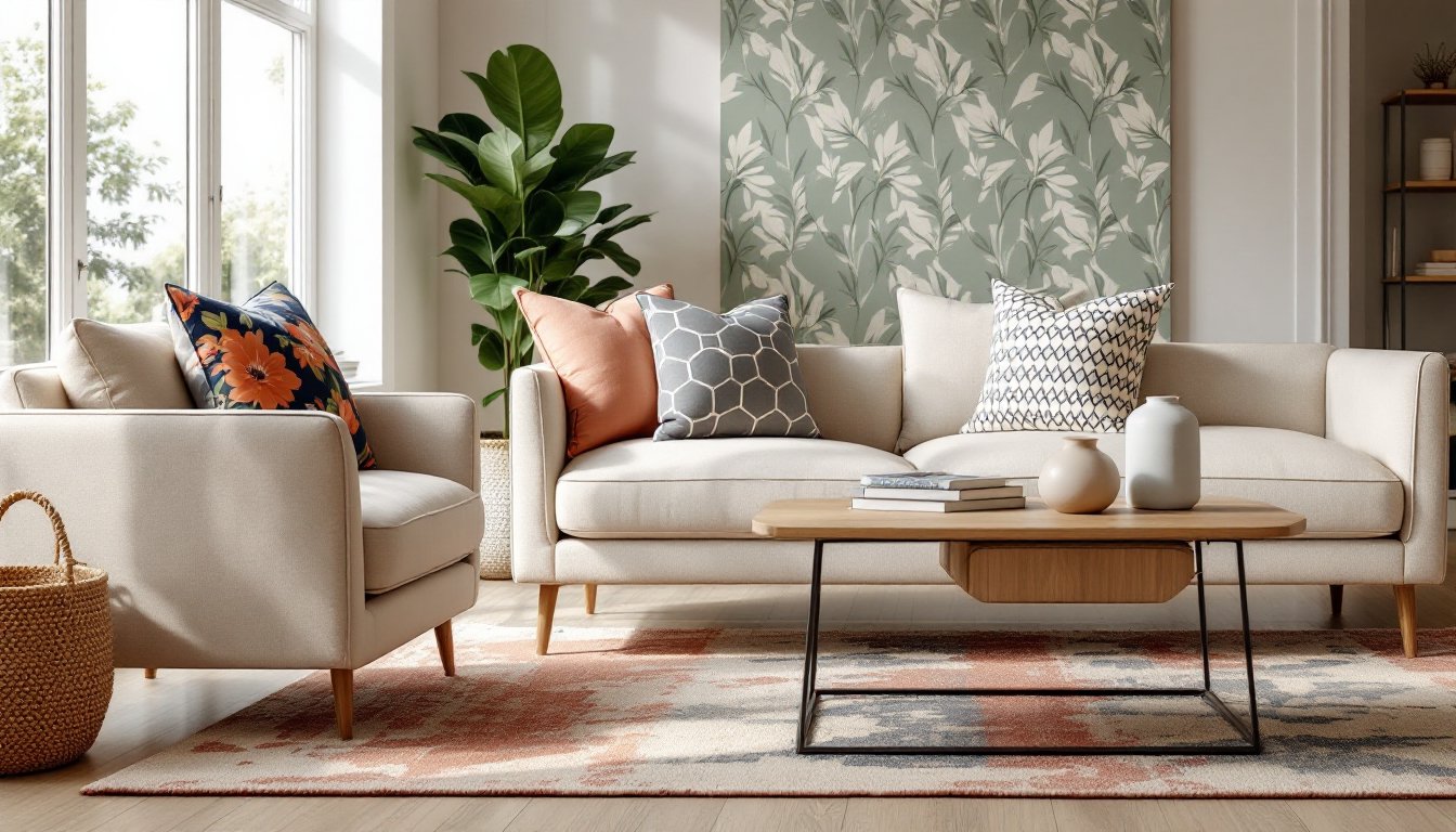
- Successful pattern mixing relies on the scale and proportion method—combine large-scale (10+ inches), medium (4–6 inches), and small-scale (under 2 inches) patterns together, and maintain a 60-30-10 ratio of solid areas to medium and bold patterns.
- Patterns must share at least one common color across the room to create visual continuity, or stick to a limited palette of three to four colors to prevent visual chaos.
- Understanding existing architectural patterns like wood grain, tile grout lines, and shiplap boards helps prevent overloading a space with competing linear elements.
- Deploy trendy patterns on easily changeable items like throw pillows and removable wallpaper rather than permanent installations, and always test samples in your actual room under natural and artificial light before committing.
- Leave adequate visual rest areas by avoiding patterns on every surface; the eye needs solid space to rest, and balance ensures a room feels layered without becoming visually exhausting.
What Is Pattern in Interior Design?
Pattern refers to any repeating decorative motif on a surface, fabric, wallpaper, tile, rugs, or even architectural details like wainscoting profiles. It’s distinct from texture, which is about tactile variation, and color, though all three work together.
Patterns break down into several categories: geometric (stripes, chevrons, hexagons), organic (florals, vines, abstract shapes), pictorial (toile scenes, novelty prints), and textural patterns that mimic materials (faux bois, marbling, linen weaves). Each carries different visual weight and formality.
In practical terms, pattern does two things: it creates focal points and it disguises imperfections. A bold geometric rug anchors a seating area. A busy wallpaper hides wall texture inconsistencies better than flat paint. Patterns also influence perceived room dimensions, vertical stripes draw the eye up, while large-scale prints can make a small room feel even smaller if not balanced with solid areas.
Understanding what qualifies as a pattern matters because many DIYers unknowingly introduce competing patterns, wood grain, tile layout, visible fastener spacing, without accounting for them in the overall composition. Every repeated element counts.
Why Patterns Matter in Modern Interior Spaces
Modern interiors, especially open-plan layouts popular since the mid-2000s, often suffer from visual monotony. Without walls to break up sightlines, rooms need other tools to define zones and create interest. Pattern serves that function.
Solid-color spaces photograph well for real estate listings, but they lack depth in person. The eye needs variation to rest on. Pattern provides that through repetition and contrast, it gives the brain something to process without overwhelming it. This is why even minimalist Scandinavian interiors incorporate subtle stripe textiles or graphic black-and-white prints.
From a practical standpoint, pattern also affects maintenance. High-traffic areas benefit from patterned rugs or upholstery that camouflages wear and staining better than solid fabrics. A geometric runner down a hallway hides dirt tracked from exterior doors. Patterned tile in a mudroom or laundry room shows less grime than solid tile with visible grout lines.
Patterns also carry cultural and historical references that help establish a room’s character. Ikat prints signal global eclectic style. Houndstooth reads traditional. Large-scale tropical prints lean mid-century. Choosing patterns isn’t just aesthetic, it’s part of the storytelling that makes a space feel intentional rather than assembled from leftover sale items.
Essential Rules for Mixing Patterns Successfully
Mixing patterns isn’t guesswork. It relies on a few reliable frameworks that interior designers have used for decades. These rules keep a space from tipping into chaos.
The Scale and Proportion Method
The most common approach: combine patterns of different scales. Pair a large-scale print (10-inch or larger motif repeat) with a medium (4- to 6-inch repeat) and a small-scale or micro pattern (under 2-inch repeat). This prevents patterns from competing for attention.
For example, a sofa might feature a large floral print, flanked by throw pillows in a medium geometric and a small-scale stripe. The rug underneath could introduce another small pattern or remain solid to anchor the grouping. The varying scales create visual hierarchy, the eye knows where to focus first.
Avoid using two large-scale patterns in the same sightline. They’ll fight each other. Similarly, too many small patterns create visual static. The 60-30-10 ratio applies here: roughly 60% solid or subtle texture, 30% medium pattern, 10% bold pattern.
Scale also relates to room size. In a small powder room, a bold large-scale wallpaper can work because the space is contained. In a 20×15-foot living room, that same paper might overwhelm unless balanced with significant solid areas.
Color Coordination Strategies
Patterns mix more successfully when they share at least one common color, even if the hues differ in saturation or value. This creates visual continuity. A navy and white stripe, a blue-and-coral geometric, and a multicolor floral with navy accents will read as cohesive because navy threads through all three.
Another approach: stick to a limited palette of three to four colors across all patterns. This allows more pattern variety without visual chaos. The patterns themselves can differ wildly in style, a toile, a plaid, and an abstract print, but the shared color palette unifies them.
Temperature matters. Mixing warm and cool tones in patterns requires intention. A room with warm terracotta florals and cool gray stripes can work, but it needs careful balancing with neutrals to avoid feeling disjointed.
Testing is non-negotiable. Collect fabric samples, wallpaper swatches, or printed images of tile patterns. Pin them together on a board or lay them on the floor in the actual room under natural and artificial light. Colors shift depending on lighting, and what looks cohesive in a showroom may clash in a north-facing room.
Popular Pattern Types and How to Use Them
Not all patterns behave the same way in a space. Understanding their characteristics helps determine where and how to deploy them.
Stripes are the most versatile. Vertical stripes add height (useful in rooms with 8-foot ceilings). Horizontal stripes widen narrow spaces. Thin pinstripes act almost like a neutral and pair well with florals or geometrics. Wide, bold stripes make strong statements and work best on a single accent wall or a large upholstered piece, not repeated across multiple surfaces.
Geometric patterns, hexagons, Greek key, lattice, chevron, read modern and structured. They pair well with organic shapes to soften the rigidity. Geometric tile (cement tile, zellige, or standard subway tile in a herringbone layout) adds pattern to floors and backsplashes without requiring fabric commitment. These patterns tend to be gender-neutral and age well.
Florals and botanicals range from traditional chintz to modern oversized tropicals. Small ditsy florals work in cottage or farmhouse settings. Large-scale florals make bold accent pieces but can overwhelm if used on multiple walls. Botanical prints add a natural, organic feel and pair well with wood tones and greenery.
Animal prints and abstract organics (leopard, zebra, cowhide, abstract watercolor effects) function as neutrals when used in small doses. A leopard-print pillow or an abstract rug grounds a room without reading as loud as the pattern suggests. Overuse turns them gimmicky.
Plaids, checks, and gingham bring a casual, approachable feel. Buffalo check skews rustic and farmhouse. Smaller ginghams work in kitchens and breakfast nooks. Tartan plaids lean traditional and pair well with leather and wood.
Each pattern type carries different visual weight. A dense damask feels heavier than an airy line drawing floral, even if both are the same physical size. Balance heavy patterns with lighter ones or ample solid areas.
Common Mistakes to Avoid When Working with Patterns
Even experienced DIYers stumble when mixing patterns. These mistakes are the most common.
Using too many patterns with the same scale. Three medium-scale geometrics in one room create competition and confusion. Vary the scale deliberately.
Ignoring the room’s existing patterns. Wood grain flooring, tile grout lines, window mullions, and even the spacing of shiplap boards all introduce pattern. If the architecture already has strong linear elements, adding multiple striped textiles can feel repetitive. Account for what’s already there.
Choosing patterns before selecting a color palette. Start with the overall color scheme, then find patterns that fit within it. Reversing the process leads to a disjointed palette.
Overcommitting to trendy patterns. That bold tropical wallpaper might be on-trend in 2026, but will it still feel right in three years? Use trendy patterns in easily changeable elements, throw pillows, removable wallpaper, or lightweight curtains, not in upholstered furniture or permanent tile installations.
Forgetting to test in the actual space. Patterns look different at scale and under room-specific lighting. A 2×2-inch sample of wallpaper doesn’t convey how a 10-foot wall will read. Order large samples or use painter’s tape to mark out the pattern repeat on the wall before purchasing.
Mixing too many pattern styles without a unifying thread. A room with shabby-chic florals, mid-century geometrics, and coastal nautical stripes lacks cohesion unless there’s a deliberate eclectic approach with strong color or material continuity.
Not leaving enough visual rest areas. Every pattern needs solid space around it to breathe. If every surface carries pattern, walls, floors, furniture, and window treatments, the room becomes exhausting. Aim for a balance where the eye has places to rest.
Pattern mixing is a skill that improves with practice and observation. Start conservatively, one patterned element in a room, then build confidence by layering in a second, then a third. The goal isn’t to follow rules rigidly but to understand why they exist, then break them intentionally when the space calls for it.