
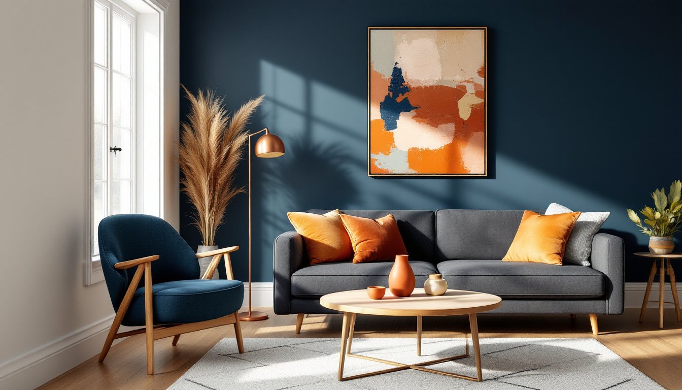
Walk into a room painted navy with burnt orange accents, and the eye doesn’t just notice, it reacts. That’s the power of complementary color schemes, where opposites on the color wheel create visual tension that somehow feels perfectly balanced. Unlike analogous palettes that whisper, complementary combinations shout with intention. They’re not for the timid, but when executed correctly, they transform ordinary rooms into spaces with genuine personality. This guide breaks down what complementary schemes are, why they work from a design and psychological standpoint, and how to apply them without turning a living room into a circus tent.
Key Takeaways
- A complementary color scheme uses colors opposite each other on the color wheel, with one color dominating at 60-70% of the space and its complement serving as a 10-20% accent to avoid visual chaos.
- Complementary color schemes establish clear focal points and visual hierarchy in rooms by creating high contrast, making them ideal for open-concept layouts and spaces that need definition without physical barriers.
- The classic complementary color pairings—blue and orange, red and green, purple and yellow—work across multiple design styles from mid-century modern to contemporary, offering both warm and cool tones in a single balanced scheme.
- Balance complementary colors using the 60-30-10 rule with neutrals as buffers, varying value and saturation levels, and adjusting saturation intensity based on room function (higher contrast for active spaces, lower contrast for restful areas).
- Test complementary color combinations with sample boards at different times of day before committing, as lighting conditions dramatically affect how these high-contrast colors appear and interact in your space.
- Texture plays a crucial role in preventing complementary color schemes from feeling flat; mix finishes like matte, shiny, linen, velvet, wood, and metal to add tactile interest and help the eye rest between contrasting colors.
What Is a Complementary Color Scheme?
A complementary color scheme uses two colors positioned directly opposite each other on the color wheel. The classic pairings, blue and orange, red and green, purple and yellow, create maximum contrast because each color intensifies the other when placed side by side.
This isn’t abstract art theory. It’s rooted in how human vision processes color. When the eye sees blue, the cones responsible for detecting orange become more sensitive. Place the two together, and both appear more vibrant than they would solo. It’s why a navy accent wall makes terracotta tiles pop, or why forest green cabinetry looks richer next to burgundy bar stools.
Most color wheels show twelve hues, making it easy to identify pairs: primary colors (red, blue, yellow) sit opposite secondary colors (green, orange, purple). Tertiary combinations, like teal and rust or magenta and lime, follow the same principle but offer more nuanced options for rooms that need subtlety alongside contrast.
The key distinction: complementary schemes aren’t about equal amounts of both colors. That’s a rookie mistake that leads to visual chaos. One color dominates (often 60-70% of the space), while its complement serves as an accent (10-20%), with neutrals filling the gap. Think charcoal walls with mustard throw pillows and white trim, not a 50/50 split of purple and yellow plaid.
Why Complementary Colors Work So Well in Interior Design
Complementary schemes solve a problem many DIYers face: creating visual interest without relying on pattern overload or expensive furnishings. The contrast does the heavy lifting.
First, they establish clear focal points. In a room full of beige, the eye wanders. Add a single complementary accent, a cobalt blue sofa against peach walls, and the space gains instant hierarchy. The viewer knows where to look. This makes them especially effective in open-concept layouts where zones need definition without physical barriers.
Second, they accommodate both warm and cool tones in the same space. Most color schemes lean one direction: all warm (reds, oranges, yellows) or all cool (blues, greens, purples). Complementary pairs bridge that divide. A room with sage green walls and mauve upholstery feels balanced temperature-wise, avoiding the sterile chill of all-cool palettes or the oppressive heat of all-warm ones.
Third, they’re psychologically dynamic. Studies on color perception show that high-contrast environments increase alertness and energy, ideal for kitchens, home offices, or workout spaces. Lower-contrast complementary schemes (think dusty rose and muted teal) still provide visual interest but read as calmer, suitable for bedrooms or reading nooks.
Finally, they’re forgiving with neutrals. White, gray, black, and beige all play well with complementary pairs because they don’t compete. A black-and-white checkered floor can anchor both red and green without clashing, while cream trim softens bold purple-and-yellow combinations. This flexibility makes it easier to phase in changes over time, swap accent pillows or repaint one wall without gutting the whole room.
Popular Complementary Color Combinations for Your Home
Blue and Orange for Warm, Inviting Rooms
This pairing has serious range. On the traditional end, navy blue walls with burnt orange or terracotta accents evoke mid-century modern or Southwestern styles. The blue provides depth and calm, while orange adds warmth without the aggression of red.
For contemporary spaces, swap in slate blue or teal alongside rust or apricot. These tones feel less saturated, making them easier to live with long-term. A teal kitchen island with copper hardware and clay-colored tile backsplash hits the complementary mark without screaming for attention.
Application tip: Use blue as the dominant color on larger surfaces (walls, large furniture), and orange as the accent in textiles, art, or smaller decor. A cobalt accent wall in a dining room paired with natural wood (which has orange undertones) and copper pendant lights creates cohesion without buying orange-specific furniture.
Paint coverage note: For a 12×14-foot room with 8-foot ceilings, expect to use roughly 1.5 gallons of paint for two coats on walls, depending on sheen and substrate. Darker blues may require a tinted primer to avoid multiple coats.
Red and Green for Classic Elegance
Red and green get a bad rap thanks to Christmas overkill, but dialed away from primary hues, this pair is sophisticated. Burgundy or brick red with sage green or olive leans traditional without feeling dated. Hunter green walls with dusty rose or coral upholstery works in both vintage and modern contexts.
This combination shines in formal spaces: dining rooms, libraries, or primary bedrooms. Both colors have historical weight, think Victorian parlors or English country estates, so they pair naturally with wood paneling, brass fixtures, and patterned rugs.
Safety note: If painting trim or built-ins in these darker tones, work in a well-ventilated area and wear a respirator rated for VOCs, not just a dust mask. Darker paints often have higher pigment loads.
Application tip: Let materials do some of the work. A room with red oak flooring (which skews orange-red) only needs green walls or furniture to activate the complementary scheme. Same with natural brick (red) and potted plants or green tile.
Purple and Yellow for Creative, Vibrant Spaces
This is the most energetic pairing and the hardest to get right, but it pays off in creative spaces: home offices, kids’ rooms, craft studios, or powder rooms where bold choices are lower-risk.
Eggplant or plum with mustard or golden yellow leans moody and sophisticated. Lavender with soft yellow or cream (which has yellow undertones) feels airy and vintage-inspired, suitable for bedrooms or sunrooms.
The trick: vary the saturation. A room with high-chroma purple (think grape jelly) and high-chroma yellow (lemon) will feel like a kindergarten. Drop both down a few notches in intensity, and the scheme becomes livable. Dusty violet walls with ochre throw pillows and white bedding work because the neutrals buffer the contrast.
Tool tip: When painting smaller accent pieces (furniture, trim, doors), a handheld paint sprayer gives a smoother finish than brushing, especially on glossy or semi-gloss sheens. Just mask thoroughly and practice on scrap first.
Application tip: Use purple on vertical surfaces and yellow in lighting or textiles. Purple absorbs light, so it recedes: yellow reflects it, advancing visually. This creates depth and prevents the room from feeling flat.
How to Balance Complementary Colors Without Overwhelming Your Space
The 60-30-10 rule isn’t just designer jargon, it’s a practical framework. Assign the dominant color to 60% of the room (usually walls or large furniture), the secondary color to 30% (upholstery, rugs, curtains), and the accent color to 10% (pillows, art, decor). With complementary schemes, the complement often fills that 10% slot, with neutrals covering the 30%.
Example: A living room with gray walls (60%), a green sofa (30%), and red throw pillows and a red ceramic lamp (10%). The green and red are complementary, but gray prevents them from fighting.
Vary the value and saturation. Don’t use pure, straight-from-the-tube hues. Tint one color lighter (add white), shade the other darker (add black), or tone both down (add gray). A room with pale peach walls and deep navy furniture feels balanced because the colors aren’t competing at the same intensity level.
Use neutrals as buffers. White trim, black window frames, wood floors, or beige rugs create visual breaks between bold complementary elements. This is especially critical in small rooms where colors can feel crowded. A 10×10-foot bedroom with red and green needs more white or cream than a sprawling open-plan living area.
Test before committing. Paint sample boards (at least 2×2 feet on foam core or primed plywood) and move them around the room at different times of day. Complementary colors shift dramatically under warm incandescent vs. cool LED lighting. What looks balanced at noon might clash at night.
Consider the function. High-energy complementary schemes (bright blue and orange) suit active spaces but can be fatiguing in bedrooms. If using them in rest areas, keep saturation low and lean into one color heavily. A bedroom with soft lavender walls and tiny pops of pale yellow in bedding reads as restful, not jarring.
Don’t forget texture. A room with matte purple walls and shiny yellow silk pillows has more contrast than one with both colors in similar finishes. Mixing textures (linen, velvet, wood, metal) prevents the scheme from feeling flat or cartoonish, adding tactile interest that helps the eye rest.
If the balance still feels off after painting, adjust with removable elements first, swap pillows, relocate art, change light bulbs. Full repaints are a last resort.